Chapter 02
Overview and challenge
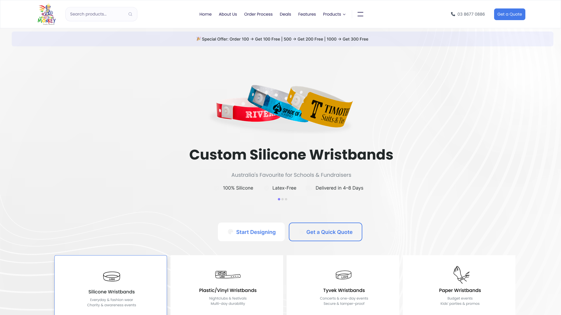
The store needed to support bulk orders for teachers, students and event organisers. I focused on making product choices clearer, customization easier to understand, and ordering simpler.
Too much text, a technical six-step explanation, cluttered forms and overloaded navigation made a simple purchase feel difficult. Without a clear product preview, customers also had to imagine the result.
- 01Complex ordering explanation
- Select, Customize, Preview, Order.
- 02Unclear quotation inputs
- Clearer fields, tooltips and structured forms.
- 03Uncertainty about the final product
- A preview that responds to text, color and logo choices.
- 04Weak trust presentation
- Reviews, organization logos and clearer reassurance.
- 05Navigation overload
- Grouped categories and supporting information.
Simplify ordering.
Give each decision a clear place in the flow.
Make customization intuitive.
Connect choices to visible feedback.
Build trust.
Bring pricing, delivery and reassurance into view.
Chapter 03
Research and findings
I used remote interviews, customer surveys, secondary research and old-site feedback to understand what customers needed before committing to an order. Three themes shaped the design.
Information overload
Long explanations and cluttered forms felt overwhelming.
Design responseI organized the experience as a guided journey with fewer distractions.
Uncertainty about the result
Customers wanted to understand what their wristbands would look like.
Design responseI paired customization with a live-preview concept and a clear review stage.
Trust concerns
Customers needed clearer pricing, delivery expectations and credible reviews.
Design responseI brought reassurance and supporting trust content closer to the decisions.
Historical competitor comparison
I compared customization, pricing, mobile usability and trust presentation to identify opportunities for the redesign.
| Feature | CustomWristbands.com | RapidWristbands | Wristband Express | Local AU Shops |
|---|---|---|---|---|
| Easy online customizer | Yes | Yes | No | No |
| Bulk discounts | Yes | Yes | Yes | No |
| Live preview | No | No | No | No |
| Mobile-friendly experience | No | Yes | No | No |
| Transparent pricing | Yes | Yes | No | No |
| Simplified checkout | No | Yes | No | No |
| Trust indicators (SSL / reviews) | Yes | No | No | No |
What I took into the design
- Live preview offered a way to help customers check their design.
- Mobile usability varied across the reviewed experiences.
- Pricing clarity and trust presentation needed attention.
- Local shops had fewer digital features in this comparison.
Chapter 04
Personas and customer journey
I used four personas to keep different buying contexts visible during ideation, wireframing and testing. Their goals stayed visible throughout the design.
Primary School Teacher
Sarah Mitchell
Melbourne, Australia
What matters most
- Order wristbands easily for school fundraisers.
- Receive reliable, on-time delivery.
- Stay within school budgets.
Key frustration
Confusing, cluttered websites.
“I just need something simple and stress-free for fundraising.”
More about this persona
Technology confidence: Medium
Other pain points
- Hidden checkout fees.
- Difficulty tracking bulk orders.
Behaviors
- Desktop at school.
- Mobile at home.
- Relies on word-of-mouth.
University Club President
Jason Lee
Sydney, Australia
What matters most
- Create wristbands that appeal to students.
- Share designs with a committee for approval.
- Keep orders affordable.
Key frustration
Long design processes.
“If it’s not quick and cool-looking, students will lose interest.”
More about this persona
Technology confidence: High
Other pain points
- Hidden restrictions.
- Difficulty obtaining shareable digital previews.
Behaviors
- Mobile-first.
- Frequently online.
- Expects fast responses.
Charity Fundraising Coordinator
Emily Brown
Brisbane, Australia
What matters most
- Promote causes with professional-looking wristbands.
- Order in bulk while maximizing value.
- Meet campaign delivery timelines.
Key frustration
Too many customization choices.
More about this persona
Technology confidence: Medium
Other pain points
- Uncertainty about durability and quality.
- Complex checkout forms.
Behaviors
- Desktop for work.
- Mobile for checks.
- Works to strict deadlines.
Corporate Event Manager
Mark Thompson
Brisbane, Australia
What matters most
- Source professional branded wristbands.
- Meet strict delivery deadlines, including rush orders.
- Provide sizes for varied audiences.
Key frustration
Unclear pricing and hidden mould fees.
“Time is money—give me clear pricing and fast delivery.”
More about this persona
Technology confidence: Medium
Other pain points
- Uncertainty about tracking and delivery guarantees.
- Poor customer support.
Behaviors
- Desktop for work.
- Values mobile-friendly tools.
- Needs clear quotations.
From choice to order
I organized the journey into four decisions: select a category, customize, preview and order.
Select category
Home → Product Categories
- Touchpoints
- Landing page; Silicone, Plastic/Vinyl, Tyvek and Paper choices.
- Action
- Select a wristband type.
- Pain point
- Similar options can be confusing.
- Emotion
- Excited but slightly unsure.
- Opportunity
- Clear category descriptions.
Customize
Design and personalize
- Touchpoints
- Text fields, fonts, colors and logo upload.
- Action
- Customize the wristband.
- Pain point
- Too many options can overwhelm.
- Emotion
- Neutral / cautious.
- Opportunity
- Live preview.
Preview
Review and confirm
- Touchpoints
- Preview and order summary.
- Action
- Check all selections.
- Pain point
- Fear of making an ordering mistake.
- Emotion
- Slight anxiety.
- Opportunity
- Reassurance and clear progress.
Order
Complete the purchase
- Touchpoints
- Simplified checkout.
- Action
- Enter essential contact, address and quantity information.
- Pain point
- Long or complex forms.
- Emotion
- Confident and satisfied.
- Opportunity
- Email a quote or place the order.
Chapter 05
Structure and ordering flow
I used closed card sorting in FigJam to shape navigation and product categories. The findings favored a product-first approach, shorter modal flows, a visible preview and two starting intentions: designing a band or getting a quick quotation.
- Silicone
- Plastic / Vinyl
- Tyvek
- Paper
The design path supports customers ready to personalize a band. The quote path lets customers ask about pricing first.
Two starting intentions
For someone ready to explore the design.
- Choose a category
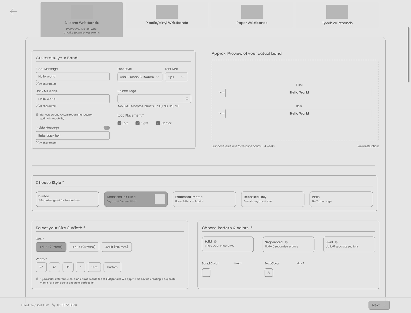
- Customize with a preview
- Review and order
Visual feedback
See the choice as you make it.
Interactive concept · try sample text and colors, then review your choices.
Up to 24 characters in this illustration.

Review before ordering
- Material
- Silicone · sample
- Message
- SCHOOL FUNDRAISER
- Color
- Purple
Check the selected text and color before continuing.
Chapter 06
Wireframes and iterations
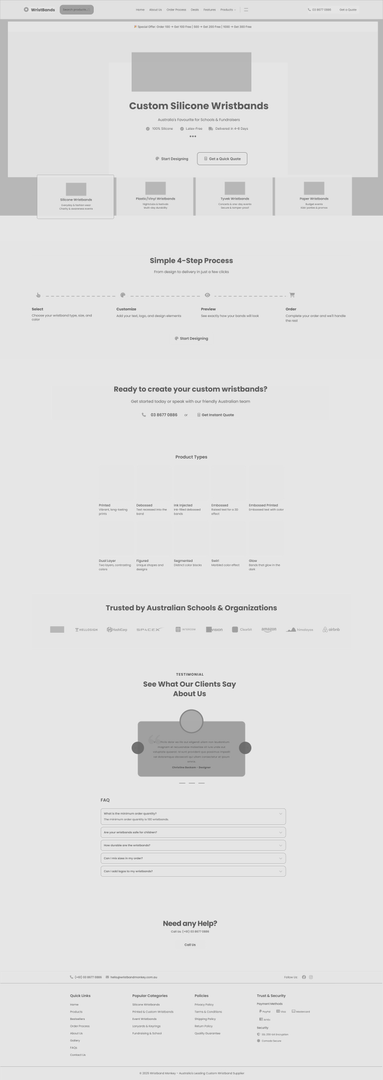
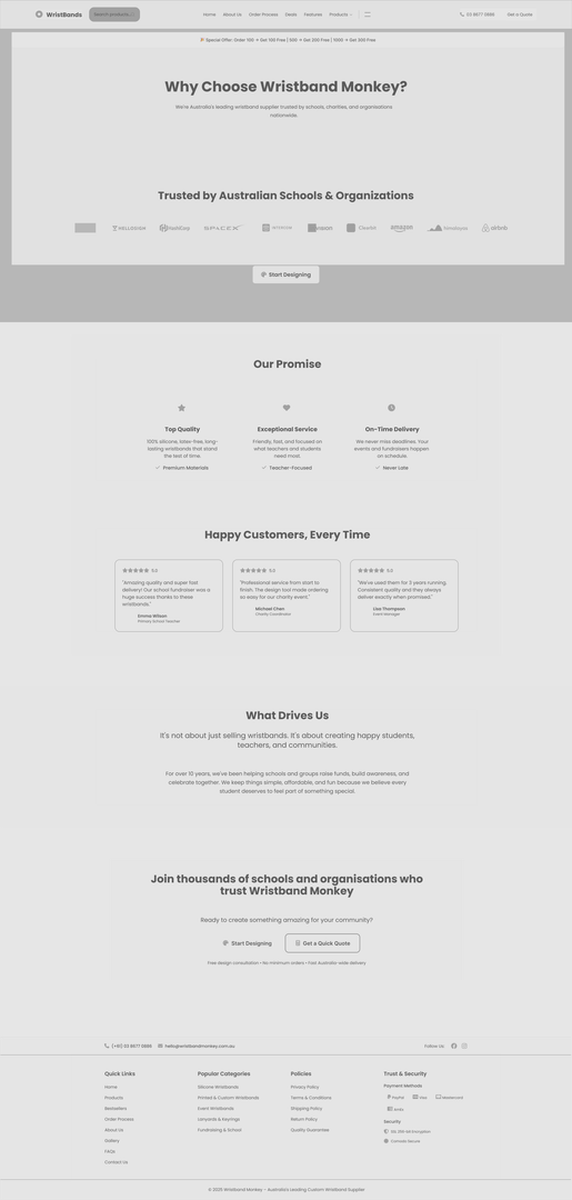
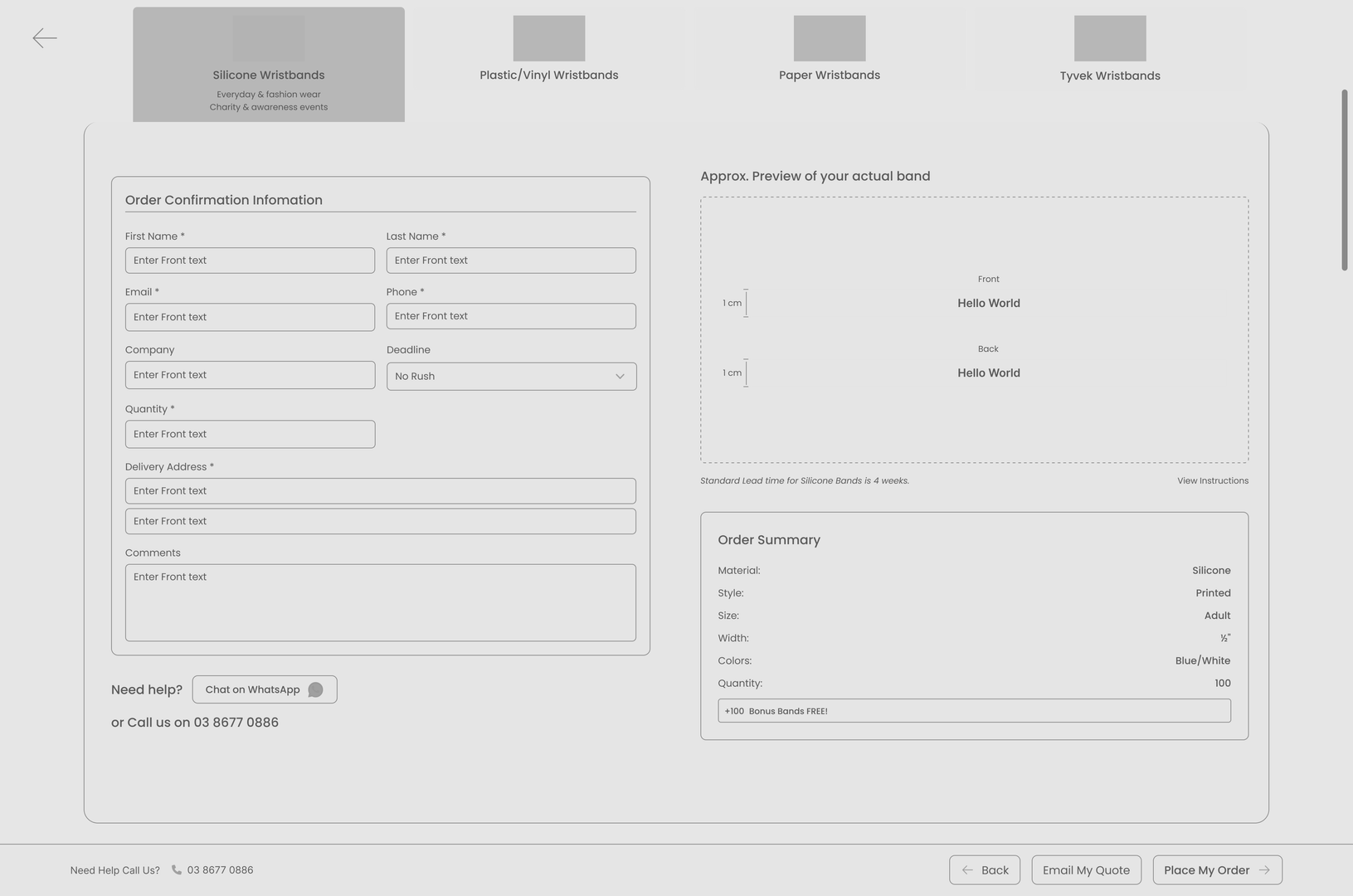
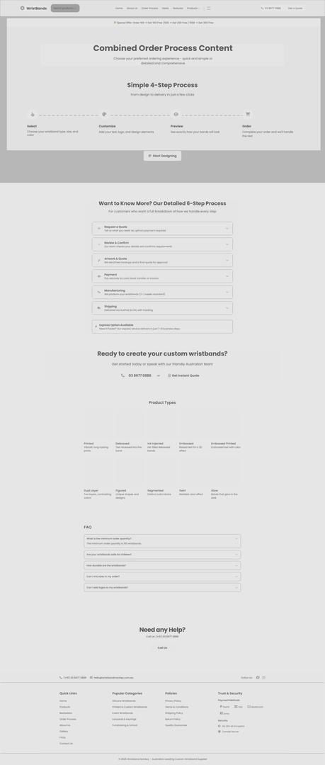
I used low-fidelity Figma wireframes to check layout, navigation and key interactions. Four rounds of quick user testing informed revisions to navigation clarity and form complexity before visual polish.
Chapter 07
Final website design
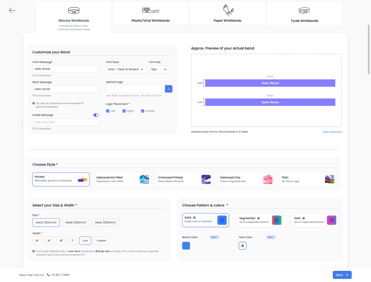
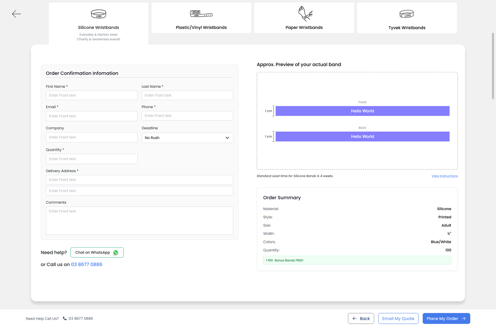
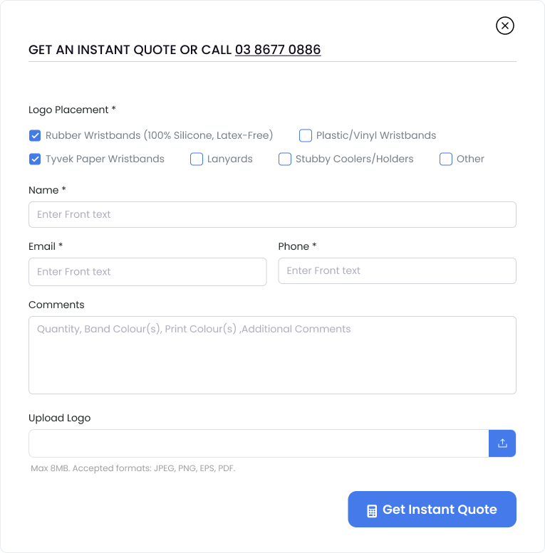
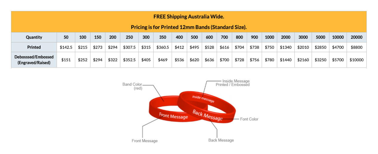
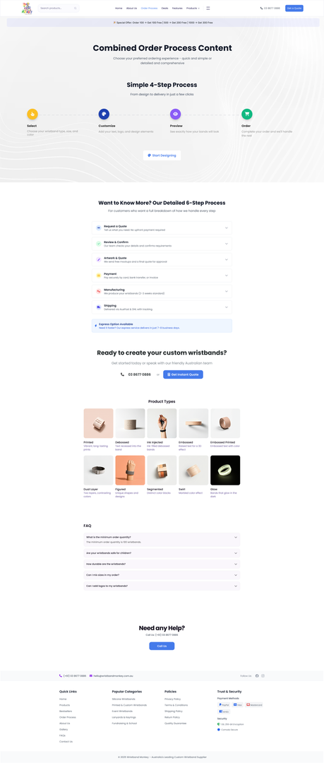
The final designs bring product choices, preview and ordering into one clearer experience. The screens below show the complete interface.
Chapter 08
Delivery and reflection
I delivered a design direction with clearer categories, a simpler ordering journey, a live-preview concept, design and quotation entry points, and supporting trust content.
- Clearer choices
- Visible customization
- A review before ordering
- Two customer intentions
- Supporting reassurance
The work reinforced the value of showing choices clearly and keeping the preview and summary close to the controls.
Keep exploring