Chapter 02
The existing experience.
The customer portal used Vue 2 and had become outdated. The reservation journey was cluttered: finding venue information, narrowing the options, and moving through booking needed improvement.
These project observations, stakeholder requirements, and the existing platform shaped the work. The starting point was to reorganize the information people needed to choose a place and continue with their reservation.
Chapter 03
My responsibility: design and front-end development.
I handled UX/UI design and front-end development of the customer portal. My scope covered reservations, Smart Dining, and online ordering; the separate restaurant platform explains the operational handoffs around those journeys.
Smart Dining is used through guests’ phones at restaurant tables, so mobile was the starting point. I carried that focus from the screen designs into implementation, revising parts of the design around the platform and delivery requirements.
Chapter 04
Three customer journeys.
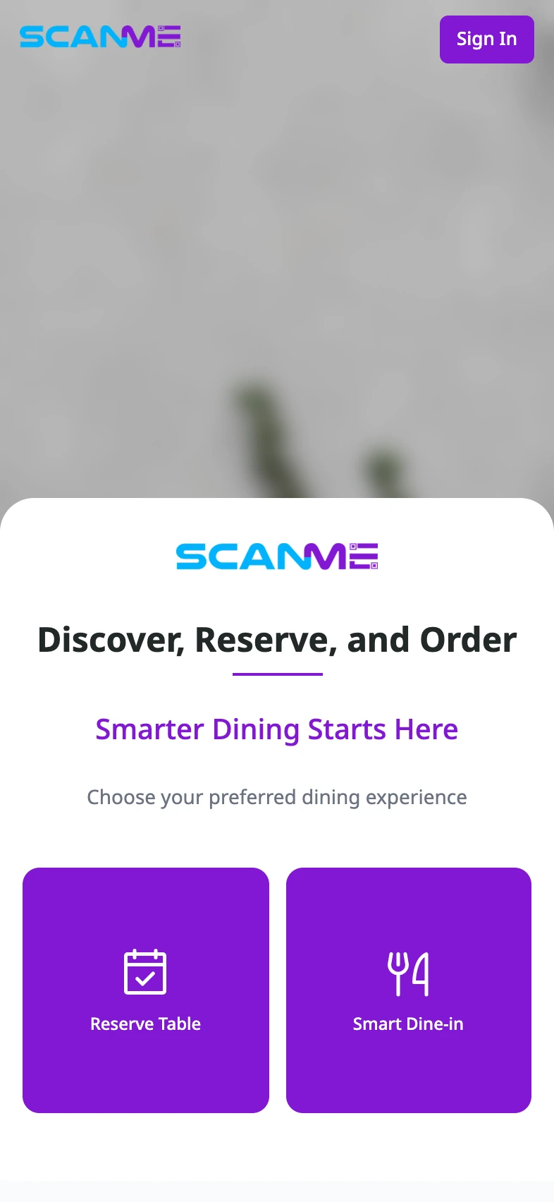
The live homepage presents “Reserve Table” and “Smart Dine-in.” The customer-portal design also includes a separate online-ordering journey. The Smart Dining requirements connect the dining experience to an activated reservation or table.
- 01 / Reservations
Discover a venue Review the place Reserve a space
- 02 / Smart Dining
Staff activate the reservation Enter through the table QR code Dine together
- 03 / Online ordering
Choose a location Order from a restaurant Follow the order
The next-phase ordering flow is represented by the supplied designs.
Chapter 05
Reservation discovery and booking.
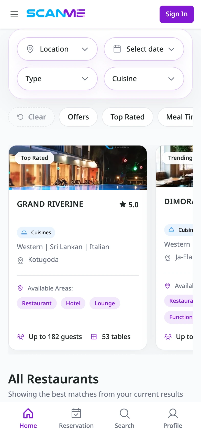
Guests needed to search by location, date, venue type, and cuisine, then review the menu, available areas, facilities, business hours, and contact details before reserving.
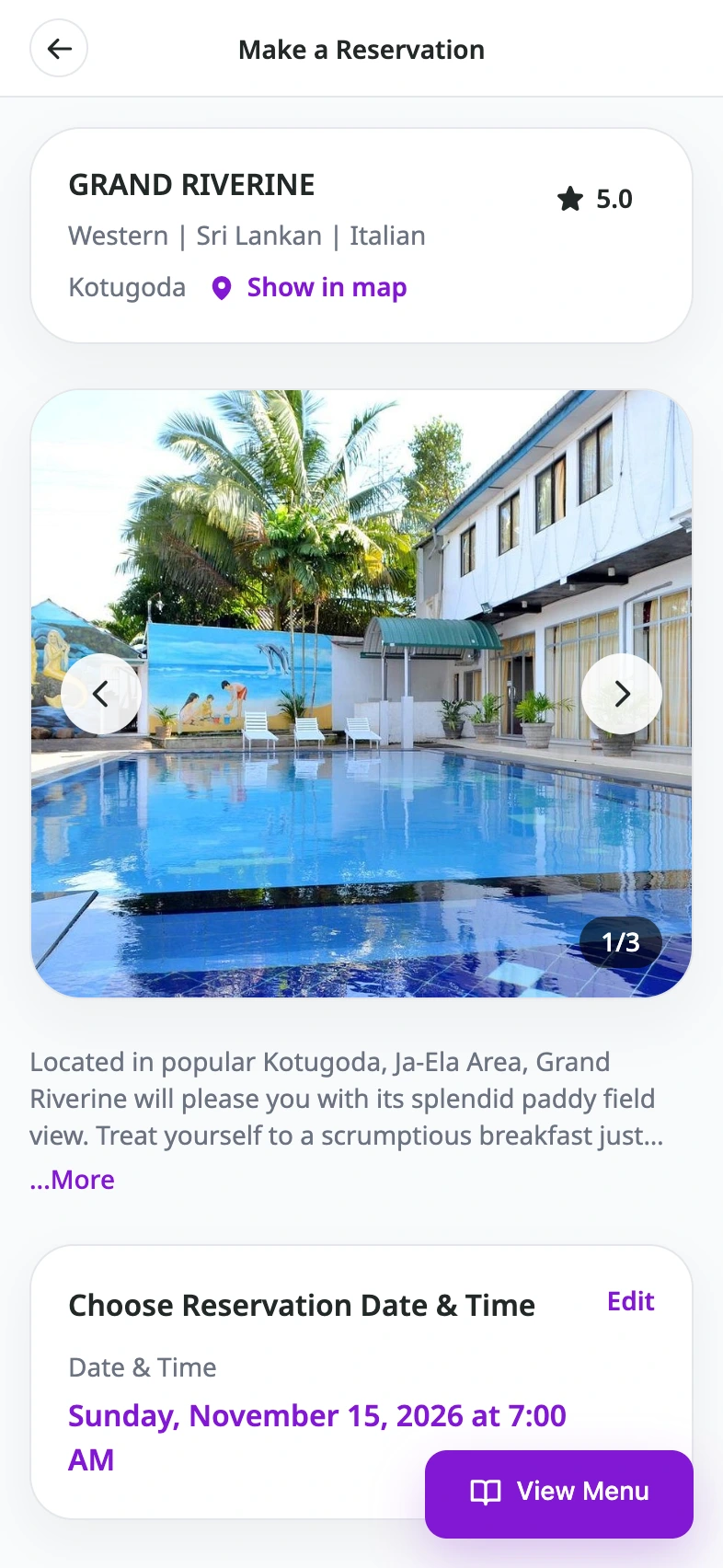
The public reservation-page capture shows the four filters above venue cards with ratings, cuisine, location, dining areas, capacity, and table counts. The restaurant profile shows venue details, photos, and the reservation date and time. In the original reservation form design, the selected space and capacity remain above the date, time, and guest-count fields.
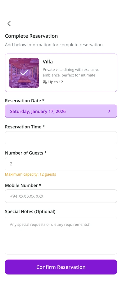
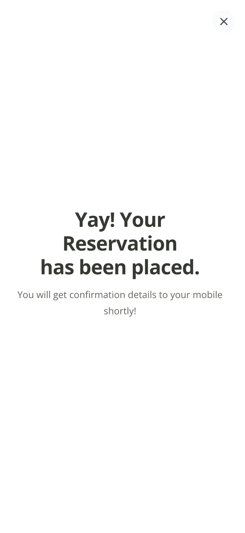
The form design keeps the space visible while the guest completes the reservation. The acknowledgement screen says the request has been placed and that confirmation details will follow by mobile.
Chapter 06
Smart Dining at the table.
The Smart Dining brief starts with staff activating a reservation when guests arrive. Guests access the table menu through a QR code, choose portions, place orders, follow preparation, and request staff assistance.
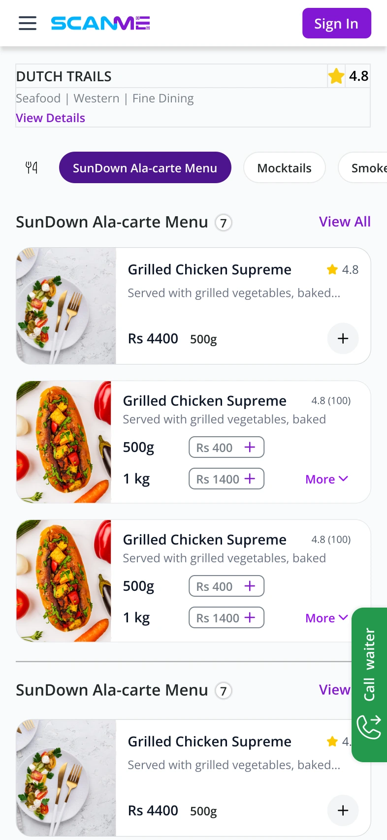
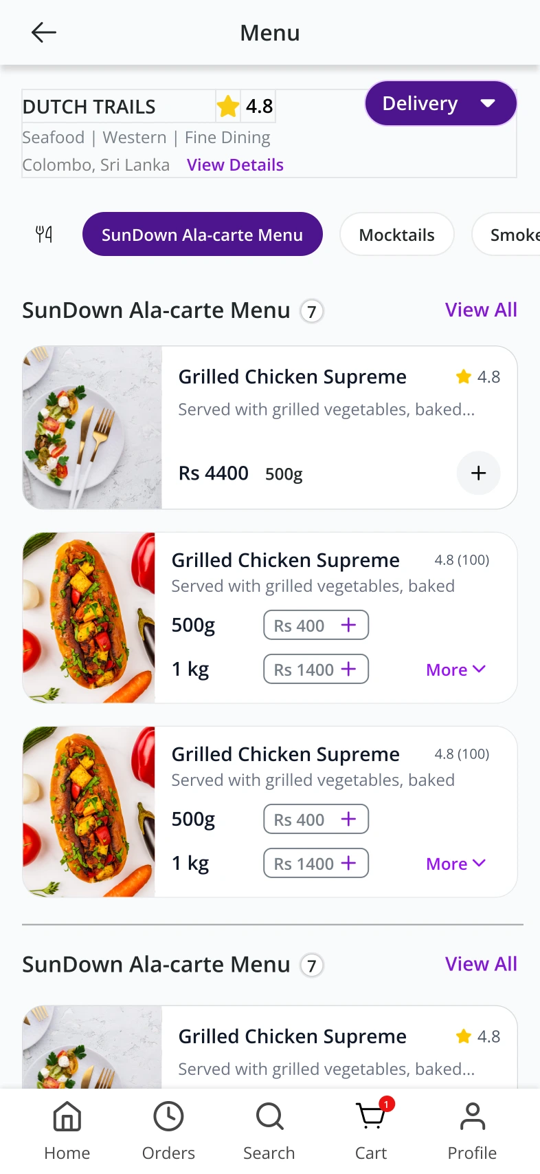
The supplied menu design shows categories beneath the venue information, portion-specific prices and add controls on dish cards, and a green “Call waiter” action at the edge of the screen.
Chapter 07
Joining a shared table.
In the intended flow, the person who made the reservation is the host. Guests ask to join. Once the host approves, they can join the shared table and bill.
- Reservation host
- Guest asks to join
- Host approves
- Shared table and bill
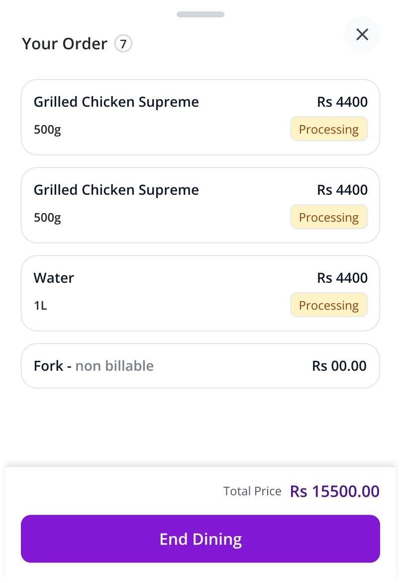
The host can request the bill and end the session. The order drawer shows each item’s status, the total, and the “End Dining” action.
Chapter 08
Online ordering.
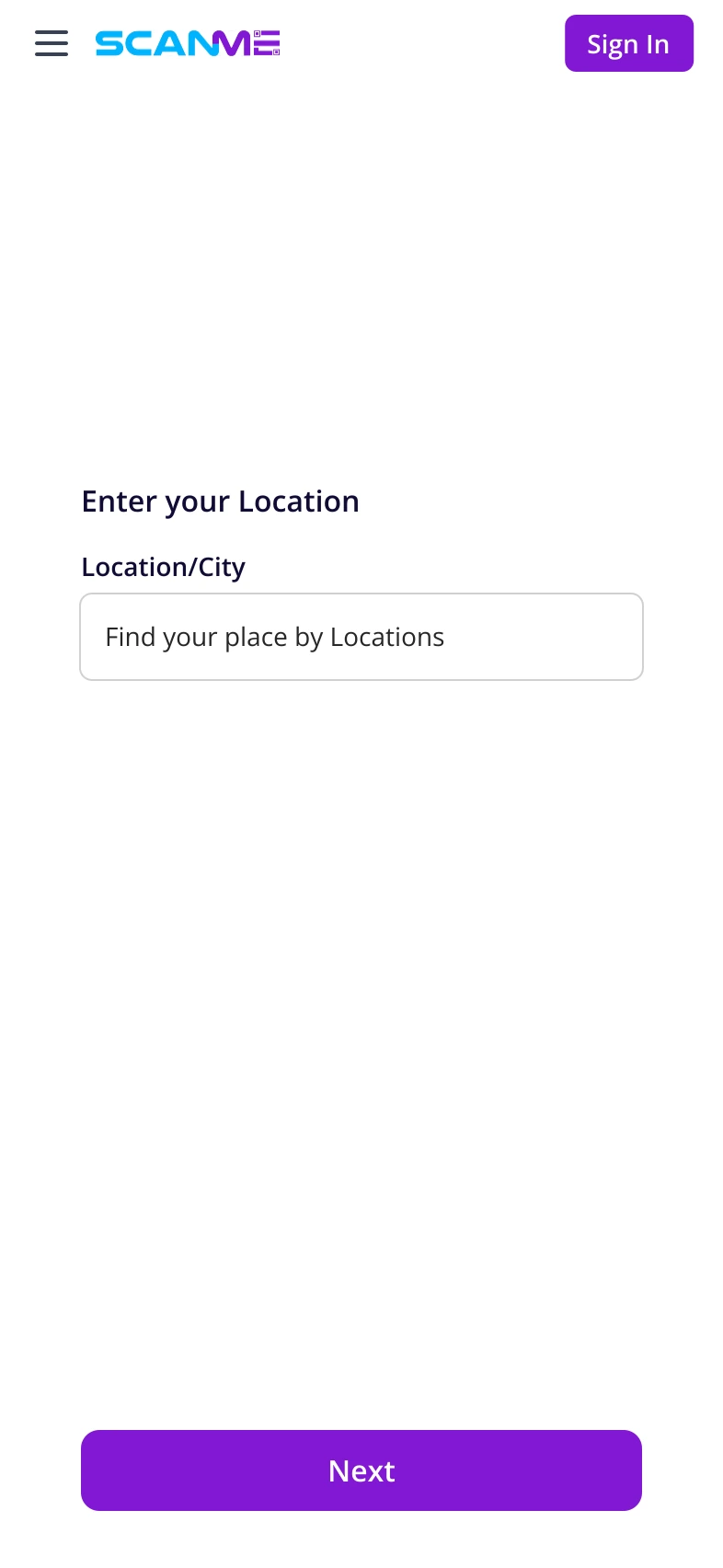
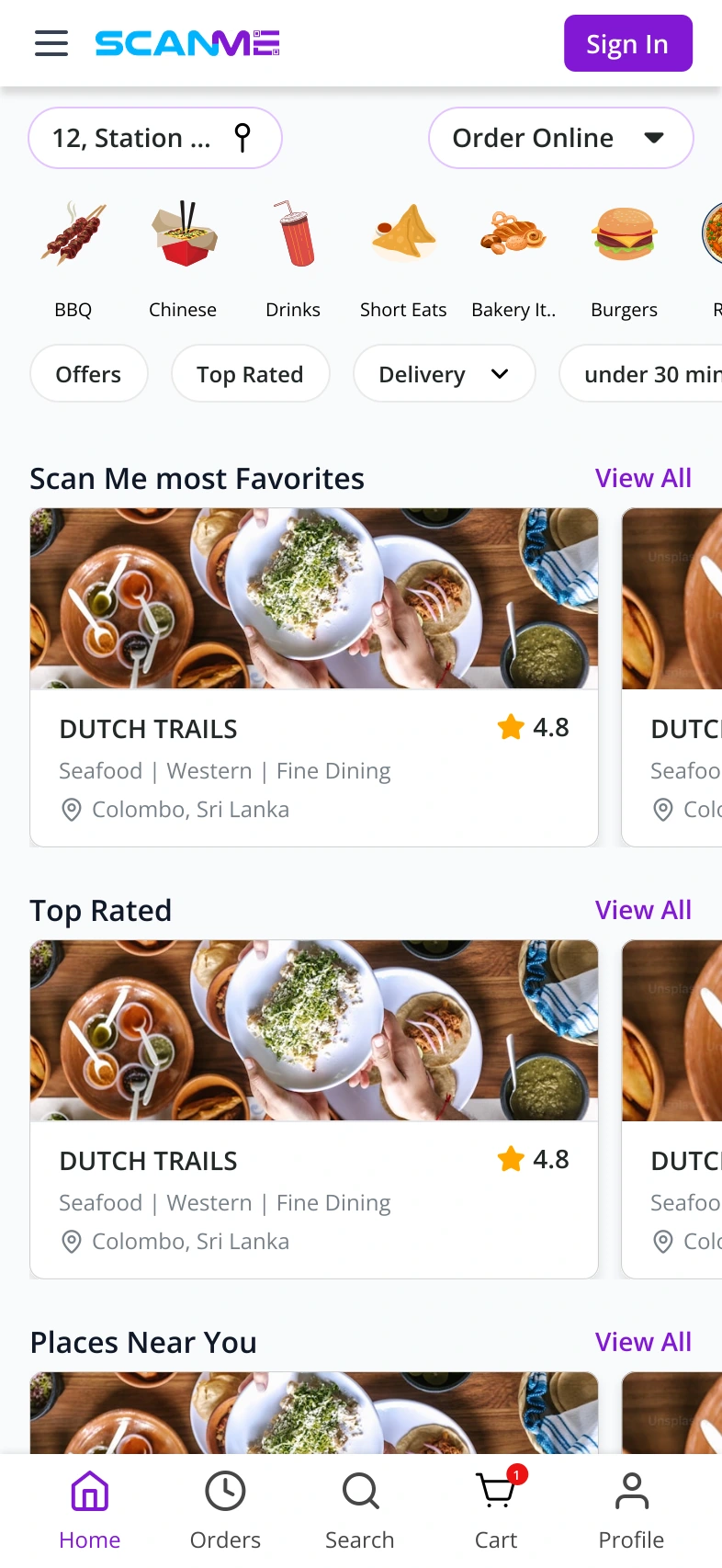
The next-phase ordering flow starts by asking guests for their location. The online-ordering home then shows nearby restaurants, cuisine categories, and delivery filters before guests open a menu.
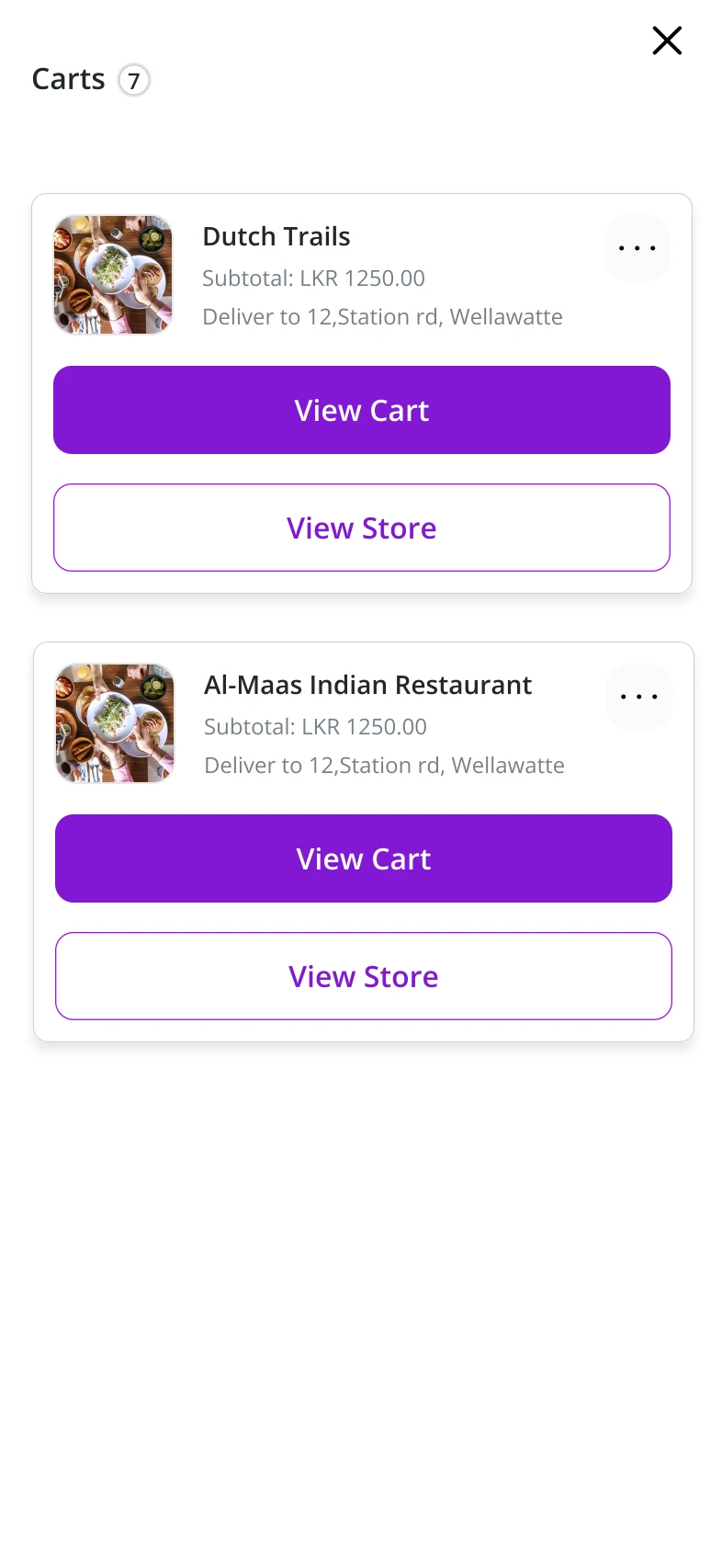
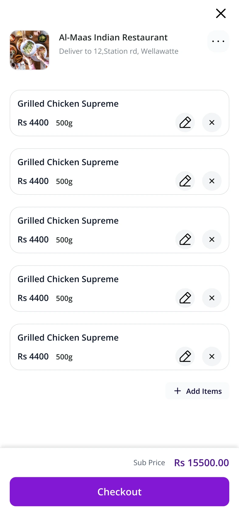
These are original Figma flow designs with example venues, prices, payment details, and times.
The menu shows dishes and portion options. The carts screen groups carts by restaurant, with actions to view a cart or return to the store. Inside a cart, guests can edit or remove items, add more, and review the subtotal before checkout.
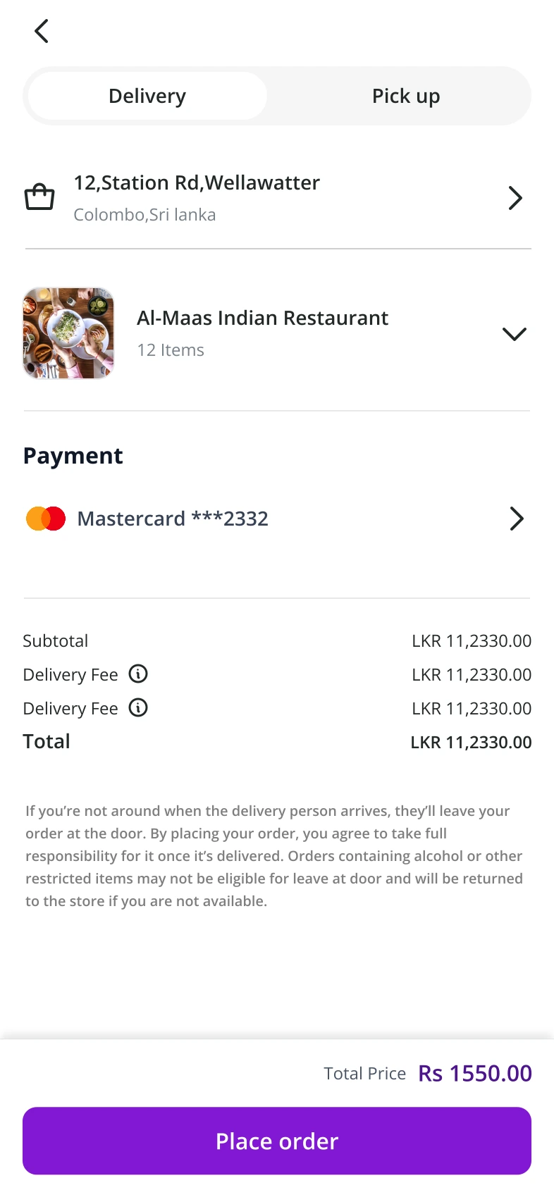
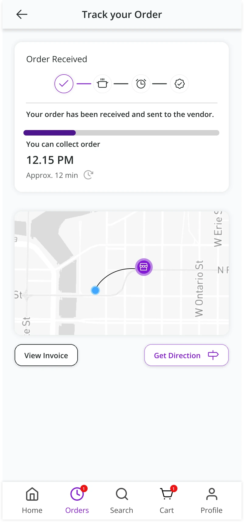
Checkout brings together the delivery or pickup choice, destination, payment method, and total. The tracking example supplied here shows an order-received state with a collection estimate, invoice, and directions. Delivery tracking is part of the ordering requirements; this image specifically illustrates collection.
Chapter 09
From design into implementation.
I upgraded the customer portal from Vue 2 to Vue 3 and implemented the redesigned front end. I used Tailwind CSS for styling and followed atomic design to organize the interface into reusable components.
My design responsibility continued during development. We revised parts of the screen designs as they moved into implementation, adapting the experience to the existing platform and delivery requirements.
Design & development
The tools behind the experience.
 Vue 3Vue 2 migration
 Tailwind CSSInterface styling
 FigmaUX/UI design
Atomic design connects the small interface elements to reusable components and complete screens.
The original Figma screens and public implementation captures represent different stages of that work. The case study uses both to explain the customer-facing experience.
Chapter 10
Delivery and reflection.
I designed the customer portal’s UX/UI, upgraded its front end from Vue 2 to Vue 3, and built the interface with Tailwind CSS and atomic design. The work covered the reservation, Smart Dining, and online-ordering journeys, with design revisions made during implementation.
The next review should follow the complete handoffs: reservation to table activation, guest request to holder approval, and checkout to the correct tracking state. That would help check the experience against the customer and restaurant requirements together.
Keep exploring